
Berry Brothers & Rudd
E-commerce website redesign
Case study report
Brief
To modernise and transform the Berry Brothers and Rudd website, bringing it in-line with current trends and improve the customer experience.
The Solution
Innovative designs, infusing best-in-class from indirect competitors and best practice UX/UI, built-for and tested with users to meet their needs; pushing Berry Brothers & Rudd ahead of competitors, with the ability to evolve and scale.
Deep dive
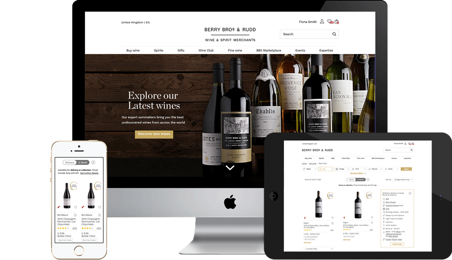
Within a significant transformation piece that spans e-commerce, web portal, mobile app, and physical, the most heavily iterated and user tested piece of work was the PLP card.
Tools used
Tools & methods used
Discovery interviews, Agile workflow, embedded team, ‘Design Thinking’ workshops, digital prototypes & user testing.


Project highlight
Creating an innovative best-in-class design that is flexible, modular, expandable, and meets the needs of new and existing customers, in an elegant way that screams premium.
Case study
This case study has been summarised below. To see the full content, or save the full case study, please click on the links below…

View full detail

View detailed PDF

Transformation timeline
1698 - Berry Brothers & Rudd first shop
1967 - Innovation, first ever temperature controlled wine warehouse
1903 - Royal warrant granted
1997 - Innovation, first UK wine merchant to have a transactional website
1999 – BBR expands its proposition, wholesale, events, and wine school
2010 - BBX trading starts, market leading platform established
2016 Reply partnership for digital transformation begins
Digital innovation
In late 2018 I joined a multi-disciplined team of designers, consultants, business analysts, and developers; working to lead the transformation of the ecommerce website and app, from a design perspective.
BBR brand vision
“Bringing the world of wines to life through pleasure, discovery and excellence”
Updating the BBR website to suit the needs of a very prestigious and respected brand’s customers, to not only modernise, but also push them ahead of competitors was by-no-means an easy challenge.

No 3 St James Street (Kingsman)
Queenstown Road
The ‘Design tunnel’
Romance Vs reality
Whilst working with the client, requirement gathering, meetings and user testing sessions were held at the head office at No3 James street, however the majority was in a ‘penthouse office’ near Battersea Park. As a company, the Reply team was embedded within BBR’s teams for back & front-end development, e-commerce website, trading app, and account hub, as well as logistics, brand identity, and modernisation.
I was fortunate enough to work with a truly fantastic team of consultants, business experts, developers for IOS, Android & web, where everyone rose to the challenges of a fast-paced, agile environment, with a no-egos ethos, in order to deliver to a challenging timeline.
The challenge, customer insights

Customer interviews:
In parallel to absorbing stakeholder requirements, user interviews were held to understand user needs:


Design tunnel and team

Gathering requirements
- Pre-workshops, initial requirements were gathered, with guerrilla research conducted, to gain a deeper understanding of the task

‘Design thinking’ workshops
- Regular workshops and brainstorming sessions were run with key creative experts, product owners, and stakeholders

Standing back and digesting designs
- A key element to the projects success was to regularly present work, absorb and digest feedback, with rapid, iterative design sprints
Competitor research for PLP card

Virgin wines
- Quick buy
- Busy
- More information available

Slurp
- Quick buy
- Hard to digest
- Not premium looking

John Lewis
- No quick buy
- Clear volume size
- Click to PDP

The Outnet
- Hard to focus on info
- Too many CTA’s
- No clear link to PDP

Burberry
- Premium
- Limited extra information
- Click to PDP
Evolution of the product listing page card

Working with the client to transform the product listing card to become best-in-class
- Finding the ’sweet spot’ for the best possible product listing card, with flexibility towards being fully responsive, containing critical information, but not too much was a huge challenge. 16 different iterations were created in total, with 4 rounds of user testing to find the right level of granularity on the PLP, hiding purchasing up-front for a premium feel, and further information at a flip of the card, via the information icon.
User testing

Rapid iterations led by user testing
- Multiple rounds of user testing were held, ensuring that each key stage of designs were verified/ challenged. Key insights from customer behaviours, and their expectations drove positive and direct changes.
PLP card - Flexibility for different user types
Everything has a purpose
- Insights gathered about customer behaviour & feedback drove design iterations to give users the most valuable features, easily accessible, at the point-of-need


PLP card, under a microscope continued
Everything has a purpose
- For users who wish to learn about and purchase products quickly, all high-level information is at hand within a PLP and just one click-away.


Business familiarisation and feedback loop
Engaging with stakeholders at a full end-to-end familiarisation session
- Heads of every department were brought together to play back design work from every key page of the website redesign. This brought together every key team who would be affected by the rebrand, increased buy-in company-wide, and engagement from copy and content teams


Design thinking workshops to delivery

Proto-design
- Initial white-boarded design from a ‘Design Studio’

Signed-off designs
- Designs after multiple design iterations, user testing, and sense-checking

Agreeing the MVP
- Working closely with the Development team, features were aligned to Dev phases/roadmap
Retail product listing page - before & after

The Prototype
The prototype will be rebuilt from the project, once the main 4 case studies are complete on this updated portfolio website…
All the work here is however 100% developed and live, so please take a look at bbr.com/offer/red-wines
In closing…
The e-commerce transformational project with BBR has been a resounding success, renewing their customer facing website, web portal, and trading app to be modernised and market-leading once-more, but also significant work on the front and back-end by a dedicated team of developers, who I was very fortunate to work with. Throughout the project, key pages designed, user tested and developed were:
• Requirements were gathered from both the business and customers
• Granular discovery introduced, appealing to seasoned wine buyers and novices
• Key insights were engrained. throughout the final design, from end-of-sprint user testing
• Navigation, hierarchy, content, brand, web responsiveness, and usability for various customer types were all greatly enhanced
• E-commerce core website pages were created using best-in-class from indirect competitors
• The outdated BBR website design was refreshed with customer needs at the heart of the redesign
Want to chat to me about a project or joining your team?
See other projects


